We have updated the content of our program. To access the current Software Engineering curriculum visit curriculum.turing.edu.
Mobile-Friendly Design using Bootstrap FE Design for Back-enders
Intro
This class is not meant to replace researching, reading, and using the Bootstrap docs to achieve responsive design in your project(s). Rather, it is meant to be a starting point for understanding the point of responsive design, and how Bootstrap chose to implement it in their framework. Please refer to the following resources for more information.
Learning Goals
- Define and identify what makes a mobile-friendly front-end design
- Apply Bootstrap to a front-end (application or file)
Resources
Other Frameworks
What is Mobile-Friendly Design?
Back in the earlier days of the internet, a website was created in HTML, CSS, and maybe some JavaScript - and you could only access websites on an “internet-compatible” computer. Now, not only can you access websites & web applications on your phone or tablet and laptop, you can update your social media profile from your refrigerator! note: other refrigerators are available. What those early internet pioneers probably never envisioned was being able to easily read & use any website from any size screen. All those devices - refrigerators, dryers, garage door openers, and yes your phone, table and/or laptop - should be able to view a website that fits their screen size, and the website should be constructed in such a way that makes it easily usable and readable. This is what constitutes a mobile-friendly design - also called responsive design.
There are plenty of frameworks and gems that make it easy to implement a mobile-friendly design. The one we’ll focus on in this lesson is Bootstrap.
In order to quickly & easily understand what a mobile-friendly design framework does, it’s important to understand CSS and its utilities.
What is CSS?
Basic Style Rules
CSS stands for “cascading style sheets”, which is a collection of rules for how a browser (like Chrome) should render markup document (like HTML) - everything from general layout to font colors & sizes. For example, if we wanted to style all <h1> elements:
   h1 {
      font-family: "Helvetica";
      color: blue;
   }
But if we wanted to style all h1 elements with a class name, like: <h1 class="title"> , these rules would ensure that any H1 element with the class title would appear in red text:
   h1.title {
      font-family: "Verdana";
      color: red;
   }
Or, only the h1 element with a specific ID: <h1 id="mainTitle">
   h1#mainTitle {
      font-family: "Times New Roman";
      color: green;
   }
Note
An HTML document only works correctly if there is ONE element with a specific ID. But, we can have many classes named the same.
Classes are plural, but an ID should be unique – just like a database!
Media Queries
To be truly “responsive” or “mobile-friendly”, your CSS should be able to adjust based on screen size. To accomplish this in CSS, we have rules called media queries. These CSS rules are (generally) human-readable and can apply to lots of situations all based on specific screen status - like width, height, hover, etc. Check out the docs to learn more.
For example, if we wanted to change the font-size property of all <h1> elements on a screen that is less than 800 pixels wide:
@media only screen and (max-width: 800px) {
   h1 {
      font-size: 22px;
      color: "red";
      font-family: "Comic Sans MS";
   }
}
Using this rule, if our screen is larger than 800px wide, then the font-size property stays the same for whatever rules came before it. But as soon as the screen shrinks below 800px, the font characteristics of those <h1> elements then change to that rule.
Try it!
This page has been outfitted with a similar media query to the one above, only it applies to any h1, h2, and h3 tag.
Shrink and expand your browser window to < 800px wide to see this query in action.
Once you create your application’s front-end structure - a section for your navigation, another section for your main body, and a section for your footer - you may need many media queries to account for ALL of the different sizes of devices from which your website may be visited. Instantly, we are overwhelmed by CSS! 🤯
How can we make this easier?
Using Bootstrap for Responsive Design
Columns
A framework like Bootstrap takes these media queries and injects them into HTML classes that we can sprinkle around our HTML pages in order to achieve responsiveness. The system that Bootstrap uses is a rows and columns approach, where an entire page is 12 columns wide. We can then divide our page into column widths based on the number of columns it should contain.
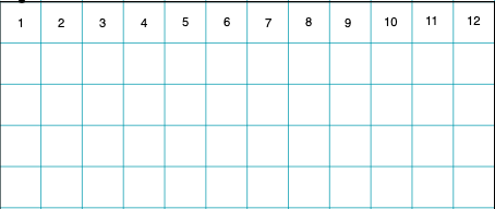
For example, if we have sections for Navigation, Main Content, and a Sidebar, we could say that our column widths would be 3, 6, and 3, respectively.
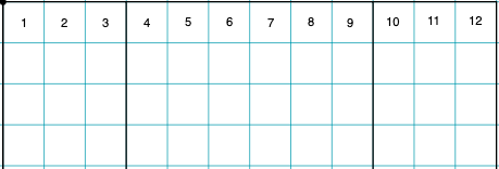
We always want our columns’ widths to add up to 12, reading them left-to-right.
This can be done in any combination you can think of! For this example, we have 3 + 6 + 3 = 12.
The 3 columns are exactly half the width of the large 6 column, which is also exactly half of the entire 12-column width.
Practice: Bootstrap Math
- From left to right, what would the column math look like for 1 small column and 1 large column?
- 3 small columns and 2 medium columns?
- 2 equally-divided columns?
- Go to your favorite news website (e.g. cnn.com, nytimes.com, etc.). What might the column widths be for those websites?
- Would it be possible to have 3 columns, with the largest column being of
9width? Why or why not?
Bootstrap Classes - Columns
Taking this math into account, Bootstrap gives us handy classes we can use to insert into our HTML to achieve the columns quickly and easily:
<div class="col-xs-12 col-sm-3">
   Navigation
</div>
<div class="col-xs-12 col-sm-6">
   Main Content
</div>
<div class="col-xs-12 col-sm-3">
   Sidebar
</div>
If we break these class names down:
colspecifies a columnxsspecifies the screen size -xsfor extra small (most phones in vertical orientation),smfor small (most phones in horizontal orientation),mdmedium (most tablets in vertical orientation),lglarge (most laptop or computer screens), andxlfor extra-large screens.[number]specifies the number of columns wide this area should contain
Rows
So far we’ve been focusing on the vertical elements - columns - but there are also horizontal areas that Bootstrap calls rows. A row is another type of container element that organizes information horizontally, inside of a vertical column.
<div class="row">
   <p>Some content...</p>
</div>
In Bootstrap’s CSS, a row should be used as a containing element for more columns, since it works to offset the CSS margin property of each column.
Example - pay close attention to this math!
<div class="row">
   <!-- my first row -->
   <div class="col-xs-12 col-sm-4 col-md-6">
      <p>First column; on tiny screens it's full width, on small screens it's 1/3 of the width, and on medium screens and bigger it's half the width. </p>
   </div>
   <div class="col-xs-12 col-sm-4 col-md-6">
      <p>Second column; similar to the above.</p>
   </div>
   <div class="col-xs-12 col-sm-4 col-md-12">
      <p>Third column, but only appears as such on small screens! On both tiny and medium+ screens, it takes up the entire row of 12.</p>
   </div>
</div>
<div class="row">
   <!-- my second row - this content will never interfere with the first row -->
   <div class="col-xs-12">
      <p>I only have one column down here.</p>
   </div>
</div>
Technically, we could have a row of columns inside of a row of columns! This can sometimes get pretty messy, but it’s possible.
In general, keep your layouts as clean & uncomplicated as possible - your users will thank you!
Practice
- Go to the BBC.com news website. On a piece of paper, sketch out the general rows & columns that fit this site’s design the best. (Note: news changes often, you may want to take a screenshot as reference.)
- Bootstrap’s classes can be implemented even in a simple HTML document - Rails not required.
- Create a file called
bootstrap_practice.html. Include the CDN files via the Bootstrap Quick Start instructions. - Take your sketched-out design from before and implement basic areas with basic content (such as some placeholder text inside of a
divelement). - Shrink & expand the view in your browser. Does it behave like you expect?
- Create a file called
Further Reading
Don’t forget to make sure your design is accessible, as well as mobile-friendly. This front-end lesson plan includes instructions on conducting a basic accessibility audit using the chrome devtools.
Checks for Understanding
- What is mobile-responsive design?
- What is a CSS media query?
- What are some popular CSS frameworks that help enable mobile-friendly design?