We have updated the content of our program. To access the current Software Engineering curriculum visit curriculum.turing.edu.
Introduction to CSS & Bootstrap
Learning Goals
- Understand between element, class, and id selectors
- Organize CSS file
- Understand how to import an external CSS file
- Difference between Grid and Flexbox
- Intro to BootStrap
Warm Up
- What do you know about CSS so far?
CSS
- Stands for “Cascading Style Sheets”.
- When we apply a
classor anidto an HTML element, we are telling it that it has a “rule”. We will write our rules for that element in our CSS file. - Each rule in CSS (i.e a
classoridrule) has a specific value assigned.ids have more specific values thanclasses. - Common misconception that “cascading” means that our browser will flow down the CSS file and the last rule will be applied.
- “Cascading” means that because more than one rule could apply to a particular piece of HTML (it might have an id and a class), there has to be a known way of determining which rule applies to which piece of HTML.
- The rule used is chosen by cascading down from the more general rules to the more specific rule required. The most specific rule is chosen.
- An
idis the most specific rule - There is a way to calculate CSS Specificity The highest number wins for most specific and will correspondingly take precedence in application of style. (nice to know, not a need to know)
Selectors
  /* element */
  p {
    background-color: blue;
    color: #FFFFFF;
  }
Class Selectors
  /* class */
  .some-class {
    background-color: orange;
  }
ID Selectors
  /* id */
  #some-id {
    background-color: purple;
  }
Note: Classes and IDs are written in kabob-case.
Organization of CSS files
- Group from least specific to most specific.
- The element selectors, class, then id.
- This helps with not only visual organization but specificity organization.
The Box Model
All the Elements are Boxes
Each element is a rectangular box. CSS leverages “the box model” to control layout and design. An HTML element is comprised of its content and the margins, borders, padding surrounding it. Boxes are “stacked” in the order they appear in your HTML. You can stack them horizontally, vertically, and in the z-plane.
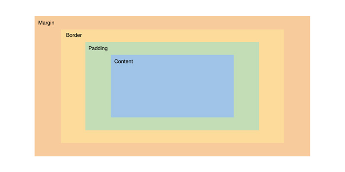
In HTML, you can visualize each element as its own rectangular box. There are a number of CSS properties that can affect the final width and height of each of these boxes. The CSS Box Model describes how the final height and width of an element is determined.
We have a div element that we gave a width of 400 and a height of 200. However, we’ve also applied several additional properties that are affecting its size and positioning. The padding and border properties are both adding 20px to the element’s height and width. Now the actual visible dimensions of our element are 480x280.
DevTools
Visit any web page, right click on any part of the page. A dropdown box will appear, with inspect towards the bottom. Click this will open your Developer Tools
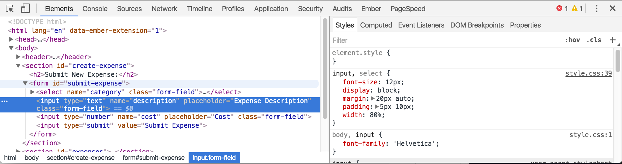
On the left you will see what is currently being rendered (original html + anything else impacting the layout such as CSS and JavaScript).
To the right of the HTML pane, there’s a small sidebar that gives us styling information for the currently selected element. If you scroll down on the right, you will see a handy graphic of how our element is being rendered.
Editing CSS
Similar to the HTML pane, we can add or remove styles and adjust CSS property values from this pane. You can click on any style property associated with the selected element and change its value. You can also use the blue checkbox to toggle the style on or off.
Linking CSS to HTML
  <!DOCTYPE html>
  <html>
    <head>
      <meta charset="utf-8">
      <title></title>
      <link rel="stylesheet" href="/css/master.css">
    </head>
    <body>

    </body>
  </html>
Flexbox and Grid
Flexbox
Flexbox is used to have a more flexible layout that helps to align and distribute space of items in a container. The container is able to alter the width/height of the items within to fill the available space. This allows the content to control the way it is displayed.
Flexbox uses a horizontal axis and vertical axis to align items and create space around those items. It is better to use for small-scale layouts and one dimensional layouts.
Flexbox Resources
Grid
Grid is used for a two-dimensional layout where both columns and rows are used. This allows us to break up the container into cells to align objects, but unlike a table, grid allows us to layer items if necessary.
Grid Resources
BootStrap
Free front-end framework that includes HTML and CSS based design templates that have a mobile first approach. Bootstrap layouts are based on a grid design. It can be quickly and easily added to projects and does use jQuery to function.
To get started using the available templates, you must first include the necessary links and script tags in our html document. Then we simply look through documentation to find what we want to include in our own html add the necessary class or classes to our html elements and bootstrap will handle the rest.
Bootstrap Resources
WrapUp
- What are the differences elements, classes, and ids?
- What all should be considered when organizing a CSS file?
- How do we link a stylesheet to an html document?
- When do we use Flexbox?
- When do we use Grid?